I created this logo to represent myself. My goal to design something that was unique that also represented my design style to communicate that with people who may come across my website or my work. I knew from the beginning that I wanted use my initials in the logo instead of my full name as well as that I did not want to use an outside icon of any kind. The most difficult part was figuring out how I wanted to style the logo, so I began to look through other designers logos in addition to some different fonts. I decided to try to combine the letters in my initials to make the logo look cohesive. Additionally, I chose an italic font because I felt that it communicates the my design style, which is modern and clean.
This logo represents All Things, which is a t-shirt company that I started up with my roommate. My goal was to design a logo that used the initials of the company, while also using a cross in it to communicate the idea that All Things is a Christ-centered organization. However, I did not want the cross in the logo to be so obvious that it would look like every other logo with a cross in it or turn off people may not know Jesus from being interested in the apparel. I drew up several different combinations of the letters A and T until I found that the best way to make them look cohesive was to make the cross the T in the logo. I then decided to add space for text at the bottom and made it italic to go along with the slant in the logo on the left side. Additionally, I experimented with making “All” and “Things” the same font with a space in between, but I found that I liked the look the best when “All” was heavier than “Things,” so that they look cohesive while also being legible to the audience.
Christian Brothers Landscaping is a landscaping company located in Seymour, TN. I made this logo during a rebrand that I did for a project in class. I attempted to give the brand a more modern look, while remaining unique from other landscaping companies. A problem I ran into while creating this logo was that a lot of landscaping companies have similar logos and visual identity. Just about all landscaping companies use green and for good reason, but it made me think even more about how I could make the visual identity of Christian Brothers Landscaping stand out. I knew that I had to use green or it would not make sense, so I decided to go with three different shades in the color palette. I then had to figure out what icon I wanted to use in the logo. I had the idea to use a plant that had Biblical ties due to the Christian background of the company such as an Olive Tree, but I did not like the way that any of those logos turned out. In the end, I decided to go with a regular tree, which still does have some significance. I wanted to make sure that tree had a unique look to it, which caused me to give the branches a smooth look and use the three different shades of green on the tree. I then added the two circles around the tree and went back later to add texture to the grass. Regarding the font, I wanted to go with something that felt modern and professional, and I feel that I achieved that look.
This is the logo that I designed for Zap Energy, which is an energy drink brand that I created for a project. I wanted every aspect of the brand to convey the idea of energy, including the logo. The first step was finding a font that looked energetic and fun, which was difficult at first, but I was able to find the perfect font for what I was going for after a while. I already had the colors that I wanted the brand to be to achieve the feel I was going for, which were blue and yellow. I knew that I wanted to incorporate lightning within the logo somehow, so I began to experiment with different images and creating paintbrushes that were lightning bolts in photoshop until I found the image that I wanted to use. I positioned the lightning bolt to be moving across the word to help emphasize the concept of energy. I used a clipping mask to put the image inside of the word and then overlayed the image with the blue that I had chosen for the brand. Lastly, I added a black stroke around the edge to help the letters pop off of the background even more.
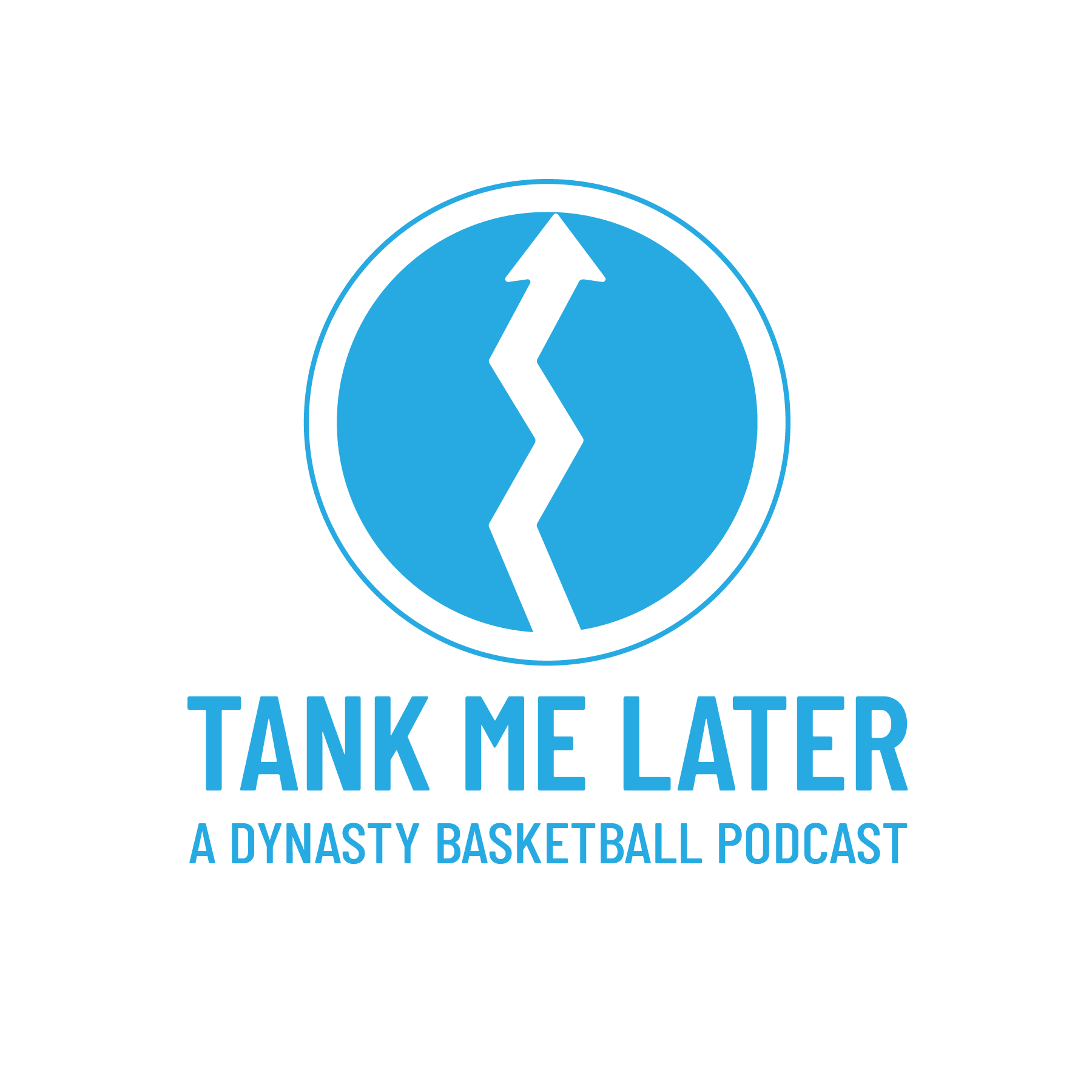
This is a logo that I created for a client for his Fantasy Dynasty Basketball podcast that he is starting up. The name of the podcast created some struggles for me creativity wise. I knew that I had to make sure that it was basketball related, so I experimented with a few different concepts that were related to what tanking is in basketball. Tanking is when a team loses games on purpose to try to get the highest draft pick possible for the next year. The NBA does a lottery for the number one pick, which uses ping pong balls, so I tried a few logos that included ping pong balls with the numbers on them, but that did not turn out the way that I wanted it to. Next, I tried to doe some typography with the three letters “TML,” but I did not like the outcome of that either. I then arrived at the idea of using a upward arrow because the name of the podcast is “Tank Me Later,” meaning that there is no need to lose, so my natural thought progression was to use an icon that implied something getting better or increasing. As for the color, the client ended up deciding that he wanted the color to be light blue.